While the Occupy Movement is still going strong in major cities all around the world, there seems to be a general lack of central unity among the groups. Sure, designers have converged to create meaningful infographics but has anyone seen a unifying symbol?
Just recently, William McMillian, Principal and Creative Director, and Lindsay Giuffrida, Art Director, decided to do something about it. They've stepped up and presented this interesting design.
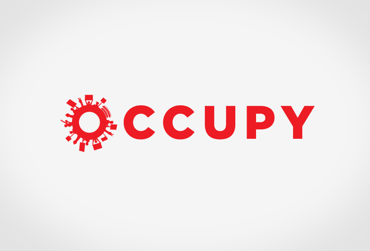
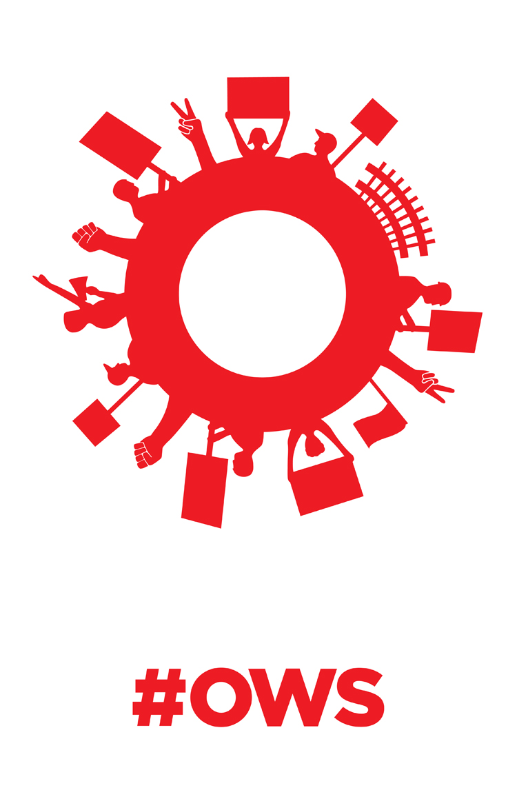
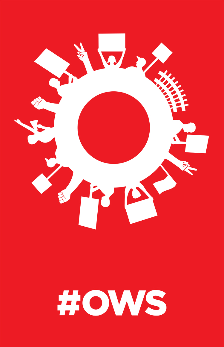
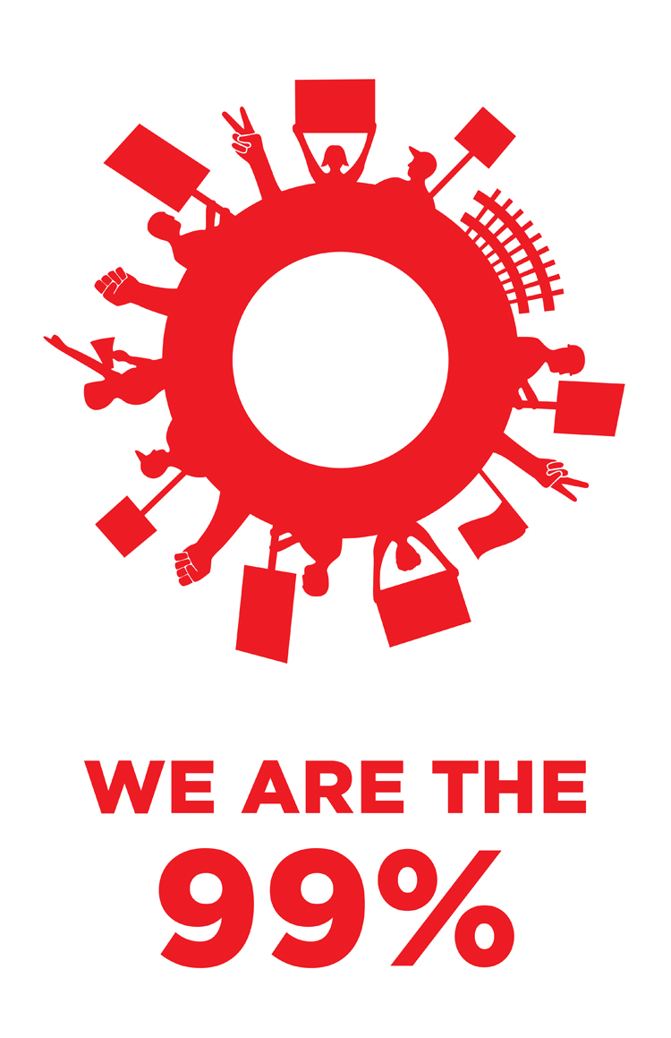
In speaking with NYC protesters and hearing about other Occupy Movements going on around the country, McMillian and Giuffrida were inspired to create this visual identity. It's a clever symbol with distinct meaning that protesters have already begun to adopt and associate with the Occupy Movement.
From the McMillian+Furlow website, here's what it means:
“The ‘O' acts as an enclosure which not only portrays the ‘O' in ‘Occupy.' but also links the efforts of the protesters nationwide who are occupying public space as way to get their message heard. Because the power behind this movement is coming directly from the people, we felt they had to be visually represented. The silhouetted figures are inspired by the crowds that continue to show their support through demonstrations, marches, signage and donations. Red is a color associated with energy, strength, power, love, determination and passion – all common emotions affiliated with the Occupy Wall Street protests.”
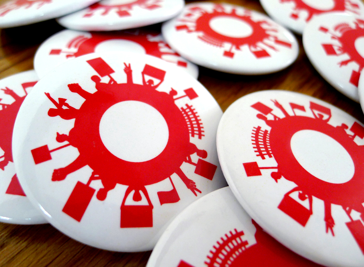
McMillian and Giuffrida have created posters and buttons with this symbol for distribution. For more information or to obtain them, check out this website.