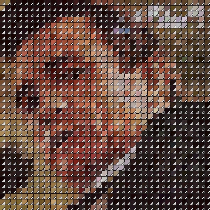
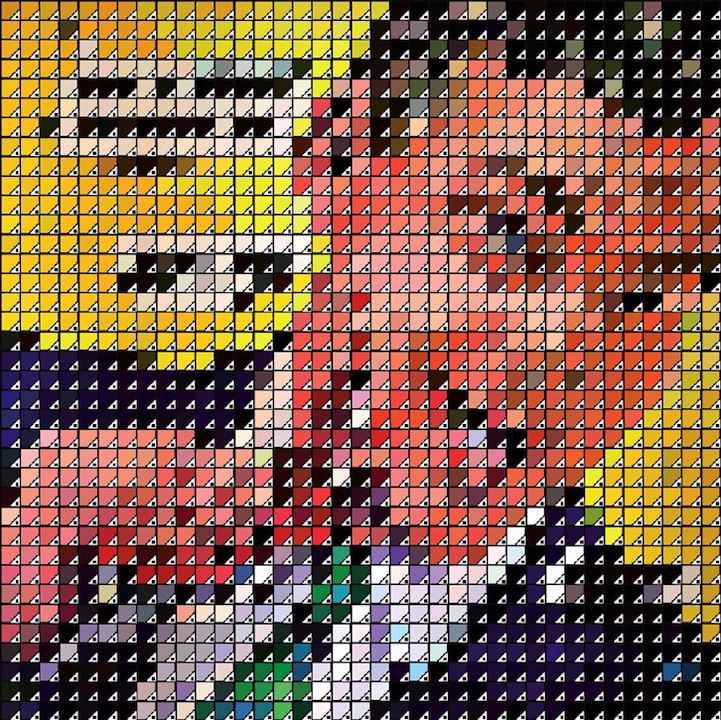
Roxy Music: ‘Country Life' (1974)

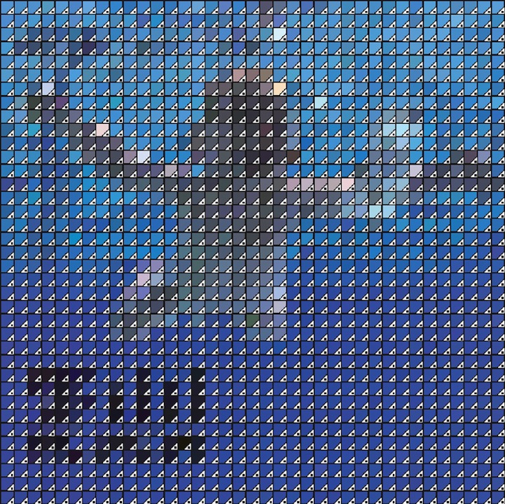
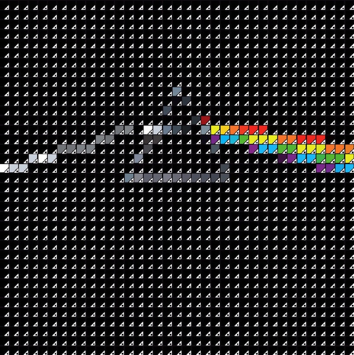
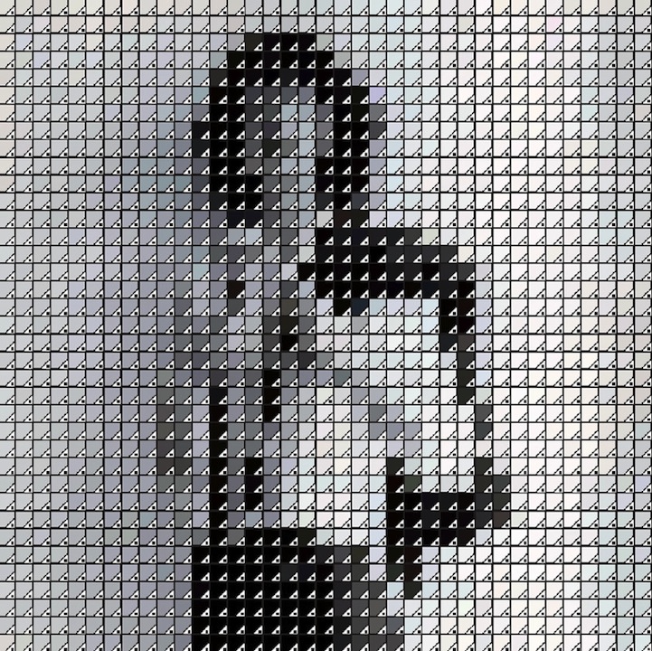
If you are a graphic designer, you will immediately recognize these little squares that represent Pantone swatches in Adobe design software. British artist David Marsh took these functional little squares and turned them into something completely new. Take a step back to get a really good look at the pixilated scenes, which use minimal amounts of colors to form the famous and recognizable artwork.
Marsh focuses on album art from 1960's through today. To create these seemingly abstract scenes, he uses 1,369 squares in a way similar to Pointillism–the practice in art of painting tiny dots of pure color in patterns to make a picture. Marsh says, “These latest works combine two ‘big likes' for me–Pantone swatches and record cover art. Up close they resemble a random mix of pantone swatch icons. Stand back, however, and your image-memory takes over and interprets an iconic album cover.”
Nirvana: ‘Nevermind' (1991)
Pink Floyd: ‘Dark Side of the Moon' (1973)
Johnny Cash: ‘At Folsom Prison' (1968)
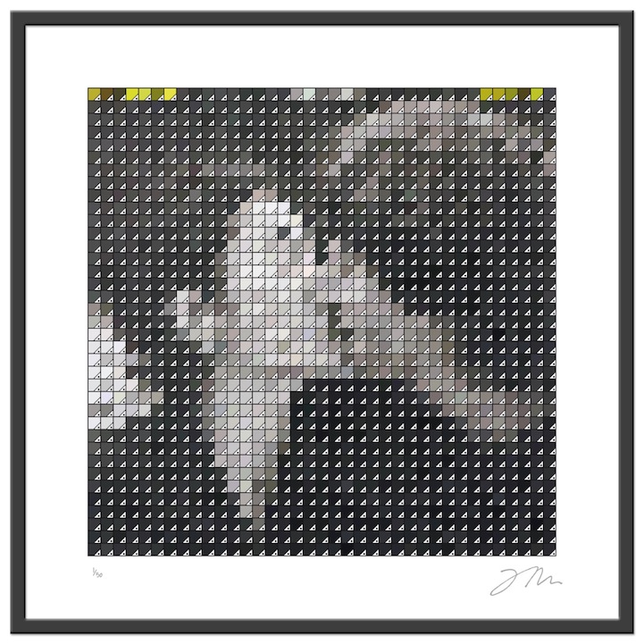
Patti Smith: ‘Horse' (1975)
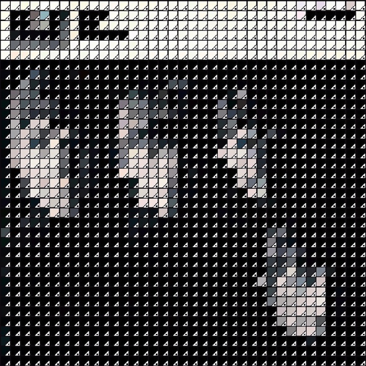
The Beatles: ‘With the Beatles' (1963)
Frank Zappa and The Mothers of Invention: ‘Weasels Ripped My Flesh' (1970)
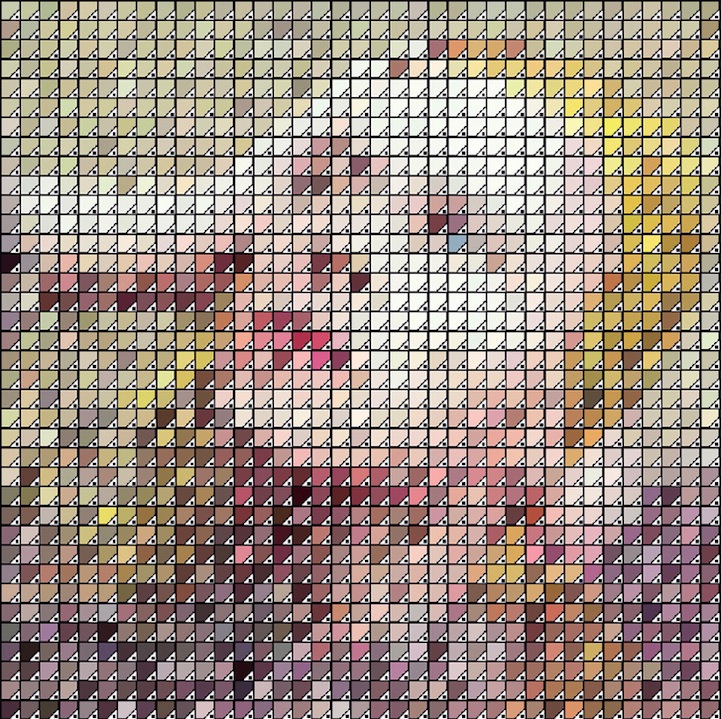
David Bowie: ‘Hunky Dory' (1971)
John Lennon & Yoko Ono: Double Fantasy (1980)
Left: Grace Jones: ‘Island Life' (1985)
Right: Bob Dylan: ‘The Free Wheelin' (1963)

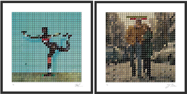
Left: Pink Floyd: ‘Atom Heart Mother' (1970)
Right: Primal Scream: ‘Screamadelica' (1991)
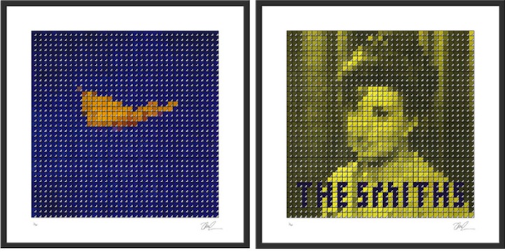
Left: New Order: ‘True Faith' (1987)
Right: The Smiths: ‘Shakespeare's Sister' (1985)
David Marsh's website
David Marsh's Graphic Design Portfolio
via [Designboom]