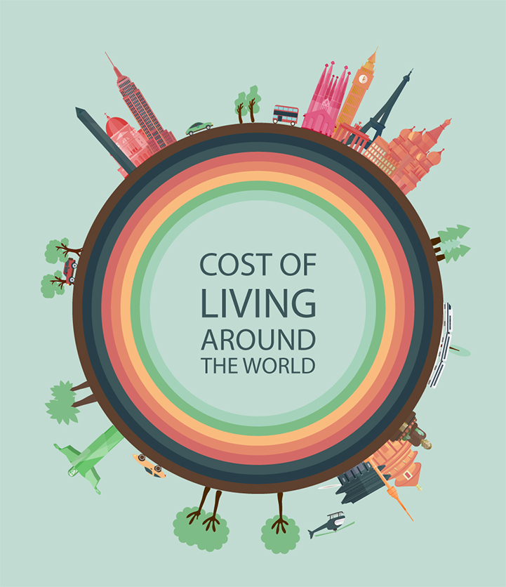
We often think about the cost of living from city to city and less often from country to country. Movehub, a resource for those moving abroad, visualized data that shows us how this cost changes around the world. They used information from the website Numbeo, which is a crowdsourced global database. Users report the prices of things like a restaurant meal, their grocery bill, and rent to help come up with a Cost of Living Index. Movehub then turned these numbers into a colorful infographic.
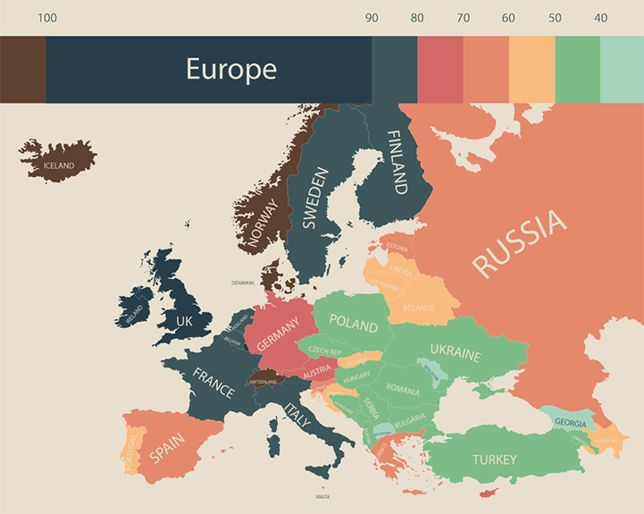
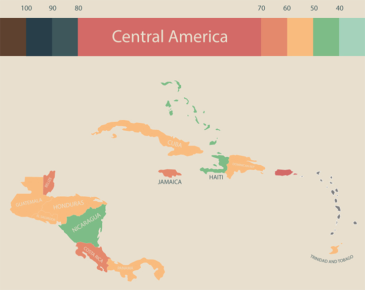
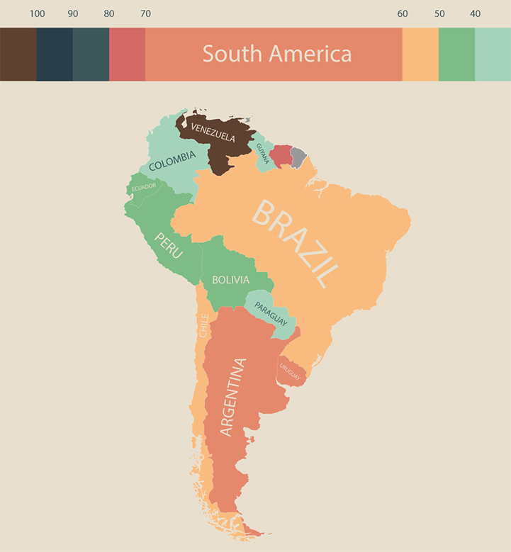
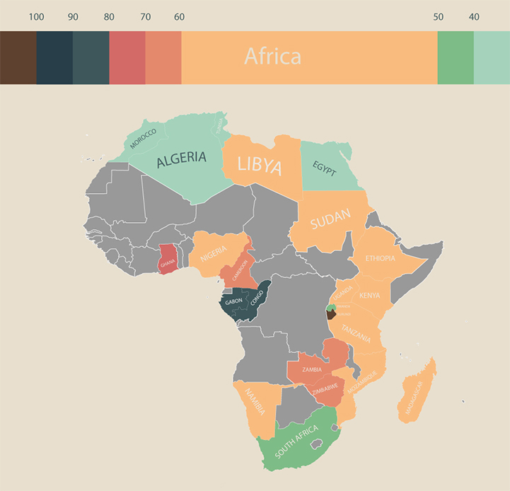
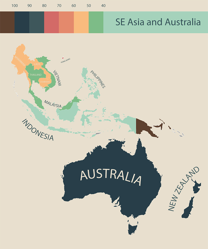
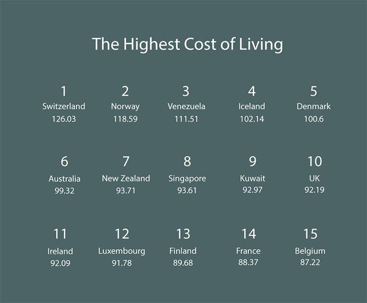
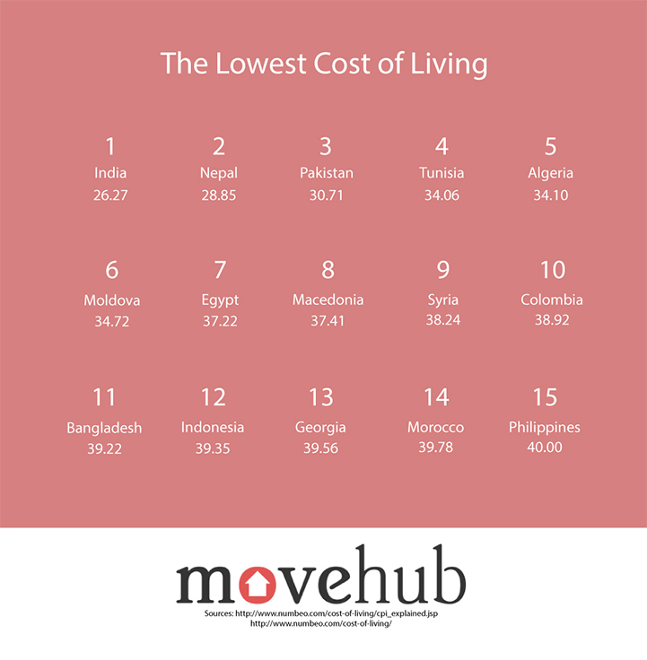
Each country is color-coded according to its index number. The higher the number, the darker the color. So, where are the most expensive places to live? Switzerland, Norway, and Venezuela rank in the top three while Iceland and Denmark aren't far behind. India, Nepal, and Pakistan have the lowest costs of living, but Tunisia and Algeria are relatively inexpensive, too. Depending on where your life takes you, this infographic can give you an idea of what to expect, cost-wise, when you move from one country to another.


 Movehub.com website and Numbeo website
via [Business Insider]