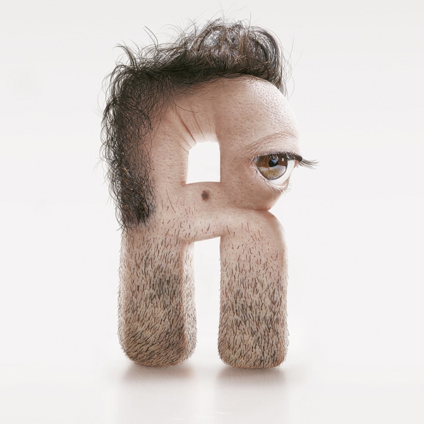
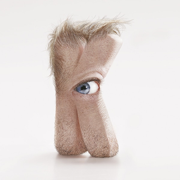
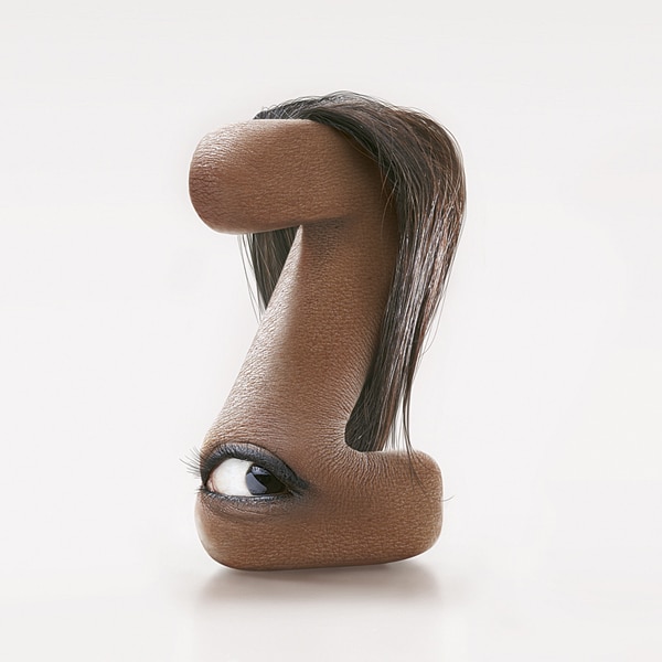
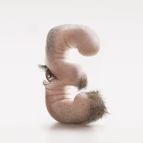
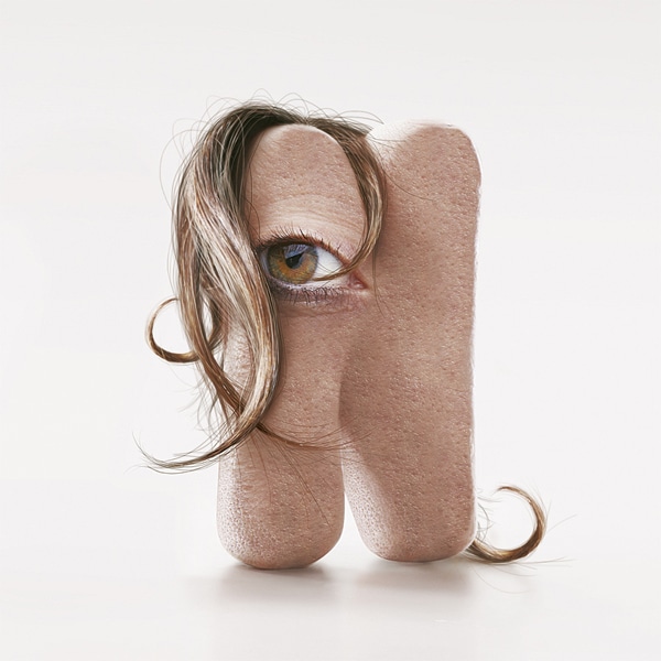
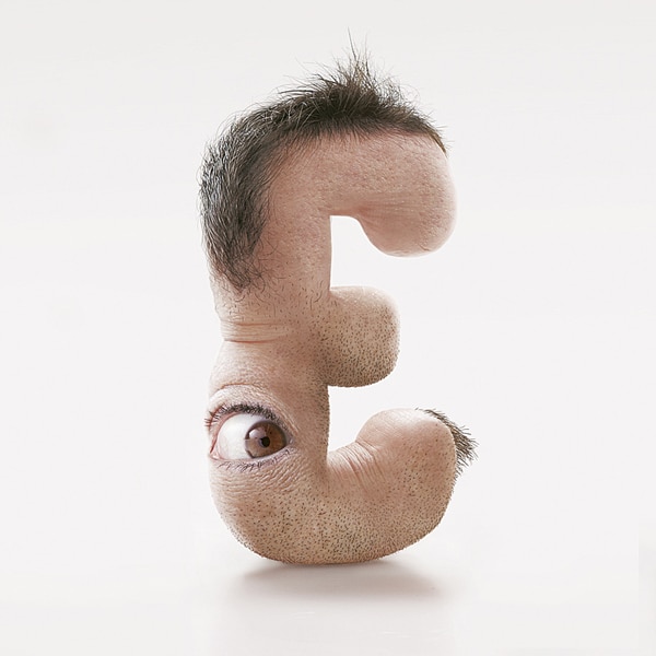
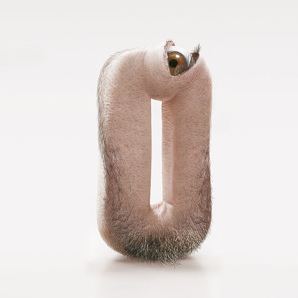
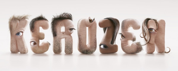
This surprisingly realistic series of human-inspired typography is quite shocking. Created by creative director JC Debroize, each unnaturally bent arrangement features a letter of the alphabet designed with human characteristics including skin, oddly placed hair, and eyeballs peering out unexpectedly from the curves and bends of each shape. However, once you get past the initial surprise that eyeballs are staring back at you, viewers can start to appreciate the fine details, the extraordinary textures, and the originality of the series.
Debroize, part of graphic design studio Kerozen, first created the shapes with modeling clay and then developed the incredibly detailed, flesh-based letters in Photoshop. Based off of the seven members of the design team, Human Type spells out the company name. “We shot pictures of the letters and of the design team’s faces. Then I made a mapping of skin textures on the letters with Photoshop and added the hair and the eyes,” Debroize elaborates. “It was not a problem to show an unflattering image of us. We laughed a lot making this.”
Kerozen: Website
via [Laughing Squid]


