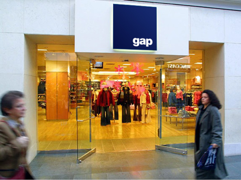
My Modern Met logo designer, Graham Smith, recently came up with his own version of the Gap logo that I thought was really clever and cool. As he says, “I have been fascinated by this whole GAP logo circus, I have made my thoughts about it fairly obvious in a previous post ‘The GAP Logo – Is the outcry and criticism justified', I then came up with a few ‘for fun' GAP logo attempts, one based on the very original and vintage 1972 GAP service mark.”
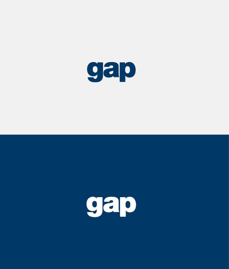
He didn't necessarily want to recreate a whole new logo, rather, he wanted to improve upon Laird+Partners' maligned attempt. His subtle suggestions? Soften it up by lowercasing the uppercase “G,” change the color from harsh black to blue, and add weight to the Helvetica font.
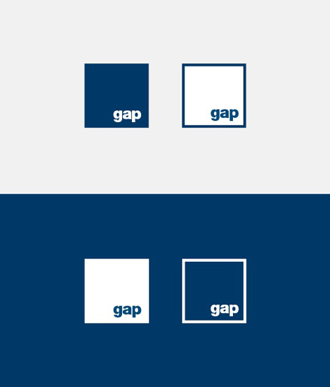
My favorite suggestion? Graham put the original box back on but placed the word “gap” at the bottom right corner, showing a visual way to represent the word. “Don't confuse your customer with a new personality if you don't really need to. A complete change of clothes is not always needed, often just a new hairstyle will do the job.” Graham Smith