 Infographics are an undoubtedly popular way to display information in the 21st century, but did you know that they've been around long before that? John Philipps Emslie illustrated a large number of maps and contributed to the British topographical archive in the mid-to-late 1800's. His highly-technical drawings reflect why we love graphics like these; they take numbers, acute scientific details, and measurements, weaving them into something that's beautiful to look at and easier to understand.
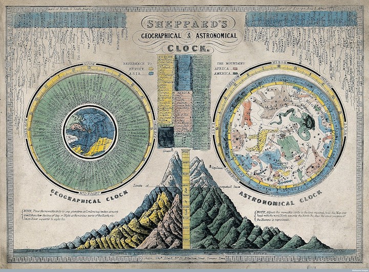
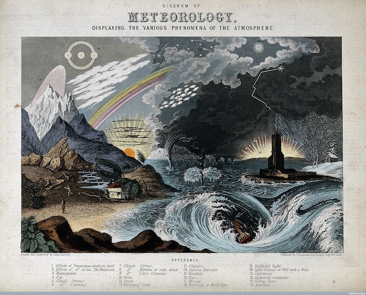
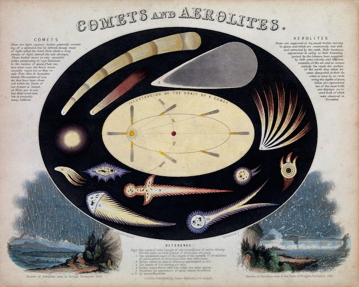
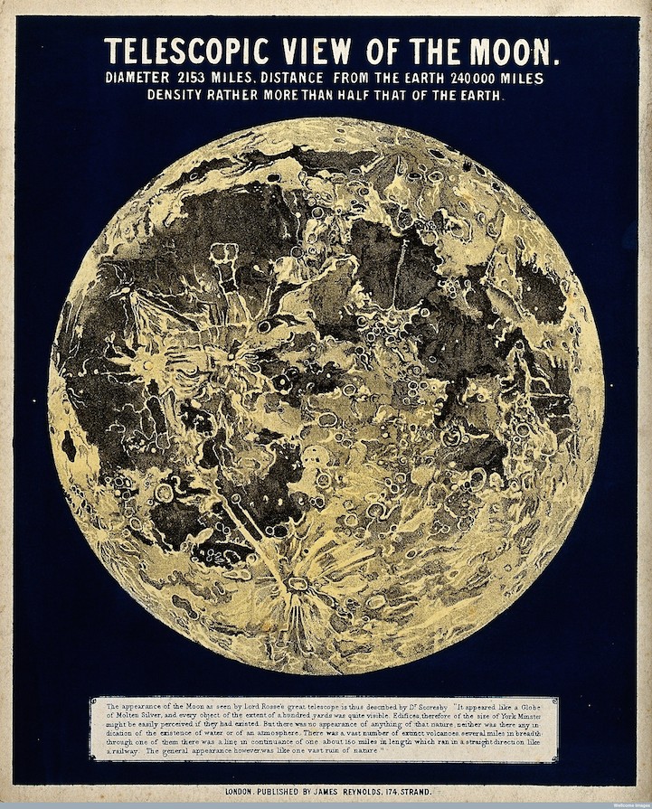
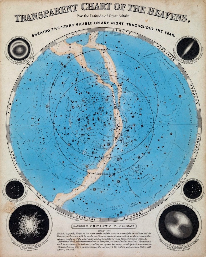
Emslie's work includes diagrams of nature and space. The scientific engravings show a telescopic view of the moon, illustrate what different comets look like, and the differences between astronomical and geographical clocks. Although we now have more sophisticated ways of sharing this type of information, these impeccably-drawn images still intrigue us with their now-historical content.
 via [
via [