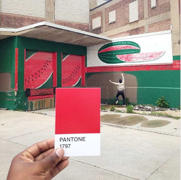
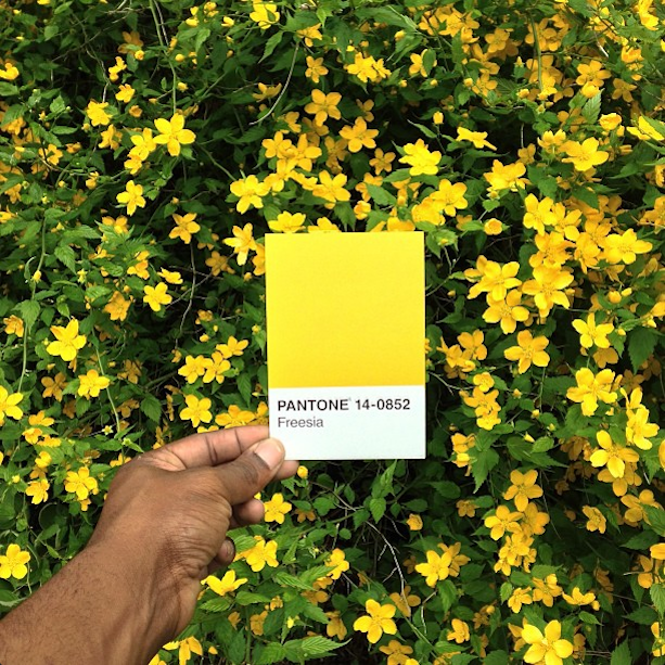
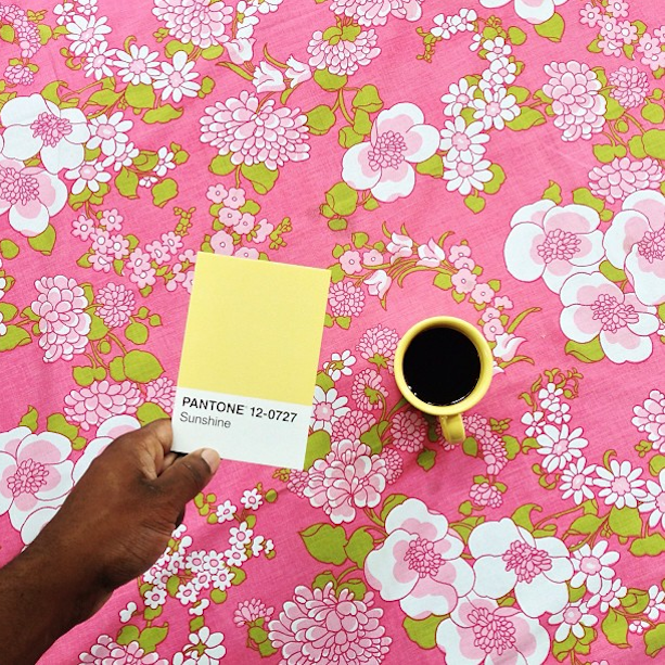
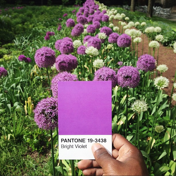
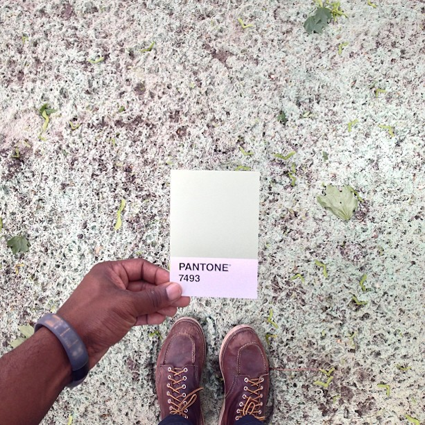
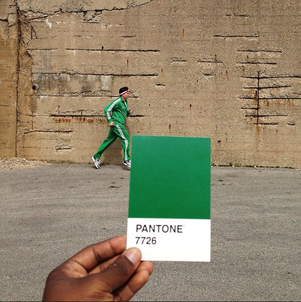
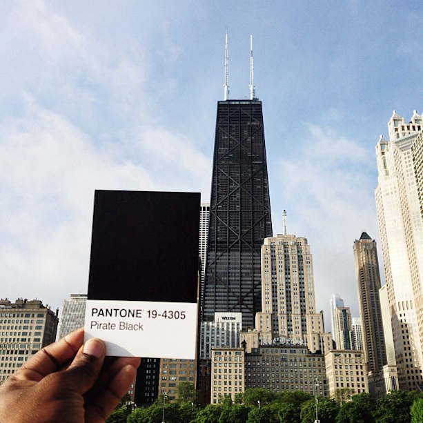
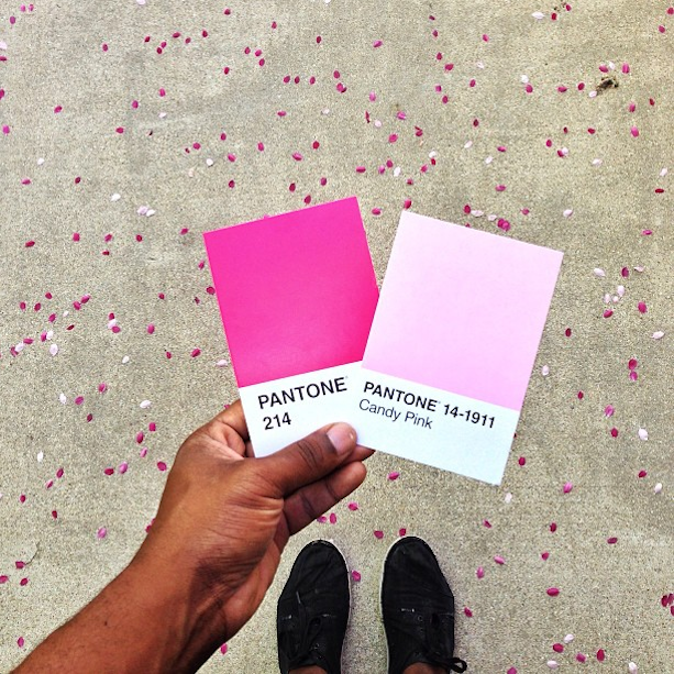
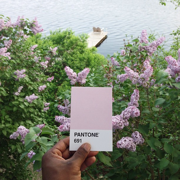
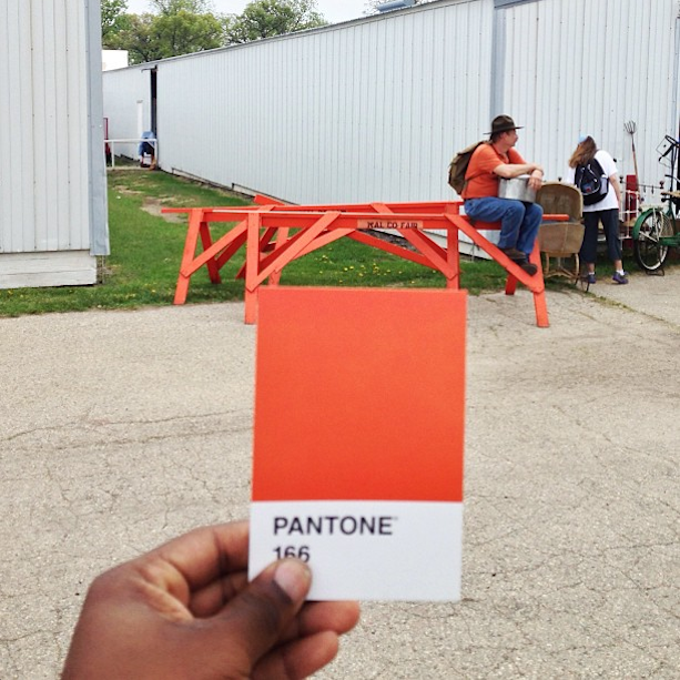
Recently on Instagram, photographer Paul Octavious has taken to matching Pantone swatches to the world around him in an ongoing series simply titled The Pantone Project. Drawing on the basic color matching system used in the printing industry, Octavious matches snippets of his everyday life to the solid blocks of color that have fun names like Sunshine (yellow), Candy Pink, and Pirate Black. By holding the swatches out with his own hand, the photographer inserts himself into each image, reminding viewers that there is a man behind the lens.
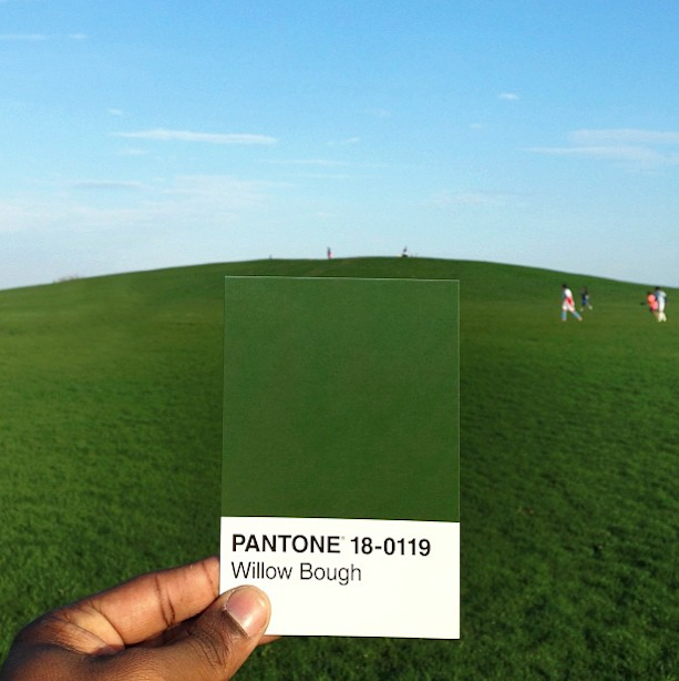
Generally, the compositions are sedentary scenes of the ground below the photographer or a stunning landscape like the one that blends the green Willow Bough swatch with his favorite hill in Lincoln Park, Chicago. However, every once in a while, an image features a moving object like a runner, mid-stride. One can't help but wonder if the scene is set-up or if Octavious is just that quick at flipping through his stack of Pantone cards, grabbing the right one, and setting up a shot before the moment has passed. Regardless, the series is a playful collection that designers or color lovers will certainly enjoy.
Paul Octavious' website
Paul Octavious on Instagram
via [Junkculture]